Zhi Si
Ming Chuan University Department of Commercial Design, Ming Chuan University

四點設計 Contact to Zhi Si for cooperation

In recent years, the gap between traditional rituals and the fast-paced modern lifestyle has caused many people to drift away from participating in the Ghost Festival. Complex preparations and concerns over food waste often conflict with contemporary values of sustainability. However, modern practices show that the symbolic meaning of offerings has gradually superseded their material function. By prioritizing sincerity and ritual intent over physical consumption, a more environmentally friendly approach can be established without compromising cultural integrity.
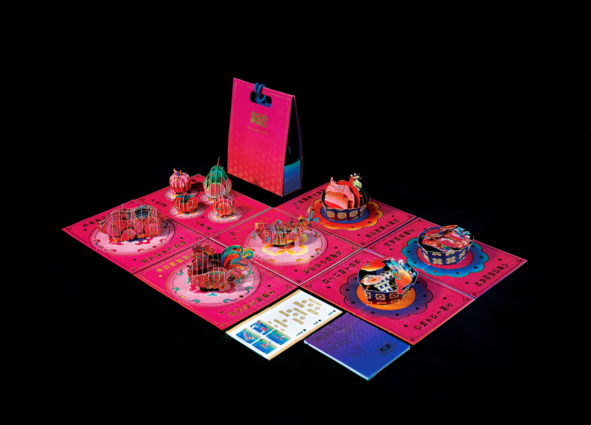
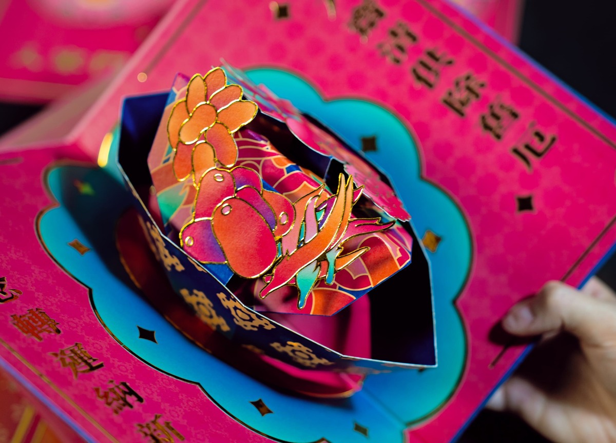
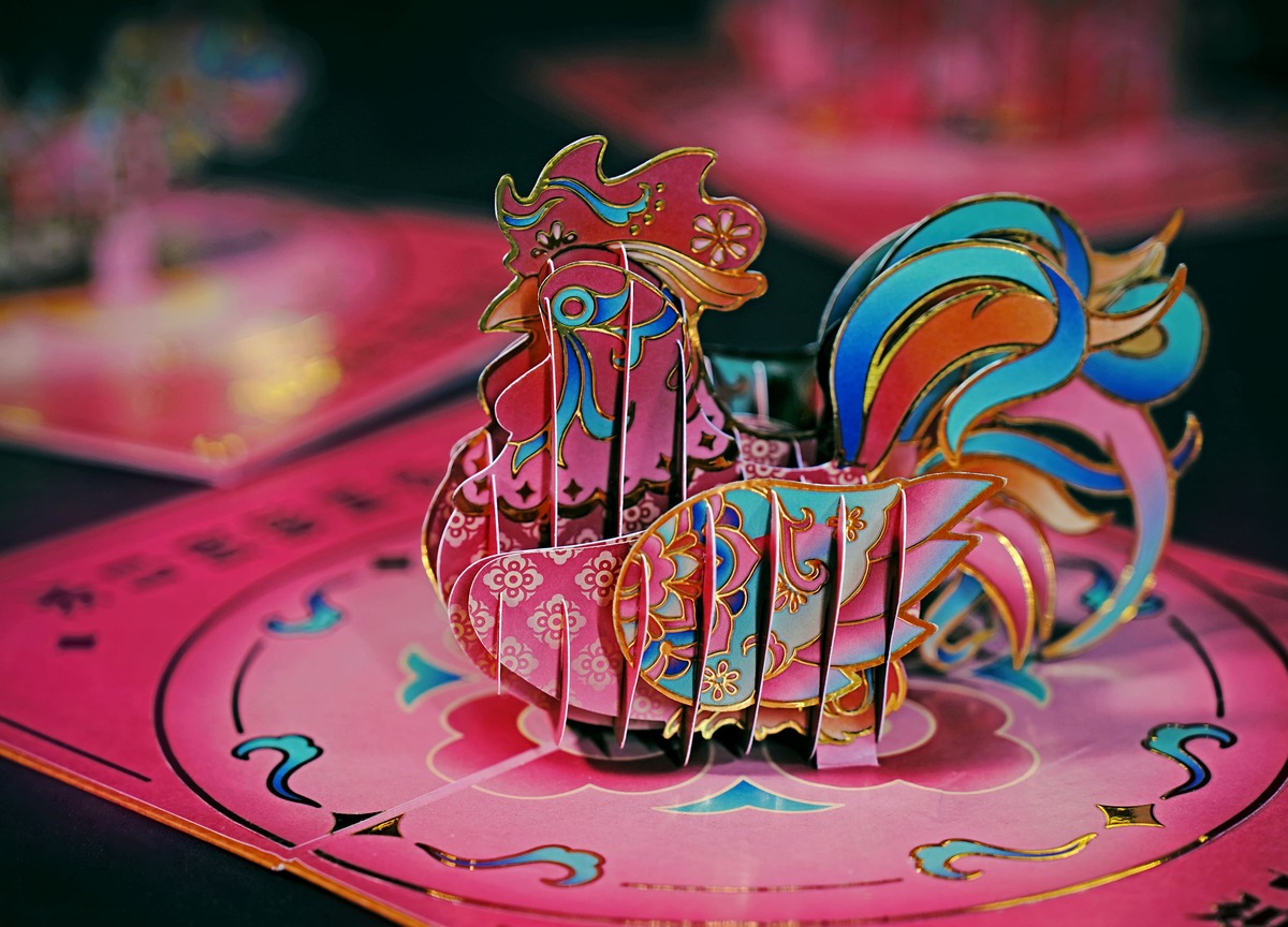
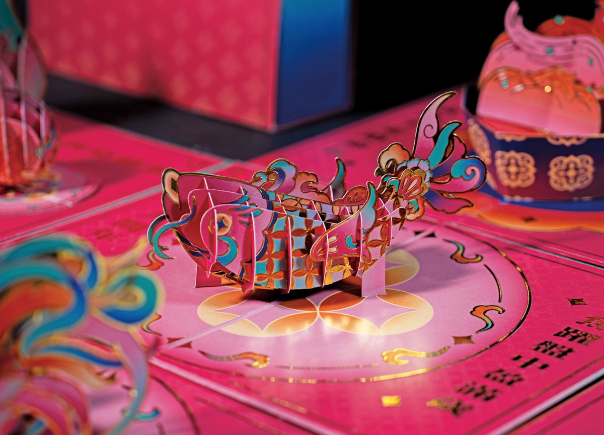
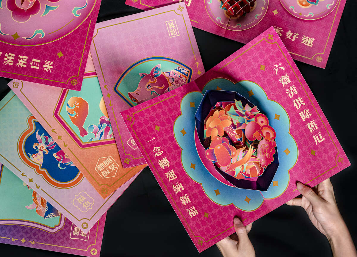
Zhi-Si emerges from this context as an innovative system designed specifically for the Ghost Festival. As a complete and ready-to-use product, it reduces the material burden of traditional worship by transforming complex rituals into a lightweight, eco-friendly system. Through collapsible three-dimensional paper structures, Zhi-Si recreates the imagery of traditional offerings. This approach honors the cultural spirit while avoiding issues of food spoilage and excessive burning. By replacing disposable items with reusable artistic forms, the ceremony continues in a more concise and vibrant manner that aligns with modern environmental values.
Zhi-Si does more than reshape physical offerings; it redefines them as collectible items that carry educational significance for the next generation. This is not a dismissal of tradition but a thoughtful evolution that responds to contemporary life and sustainability. By balancing cultural meaning with modern awareness, Zhi-Si ensures that the heart of the ritual remains a living part of the future.
ZHI-SI is a modern reimagining of traditional worship, transforming burdensome physical offerings into lightweight, symbolic paper structures. By utilizing foldable 3D designs, it preserves the sacred essence of the ritual while translating cultural symbols into a concise, contemporary aesthetic.