四點設計 Contact to Crescent Typeface Design for cooperation
Booth Number: B-01
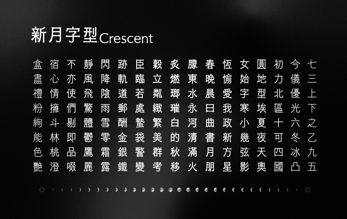
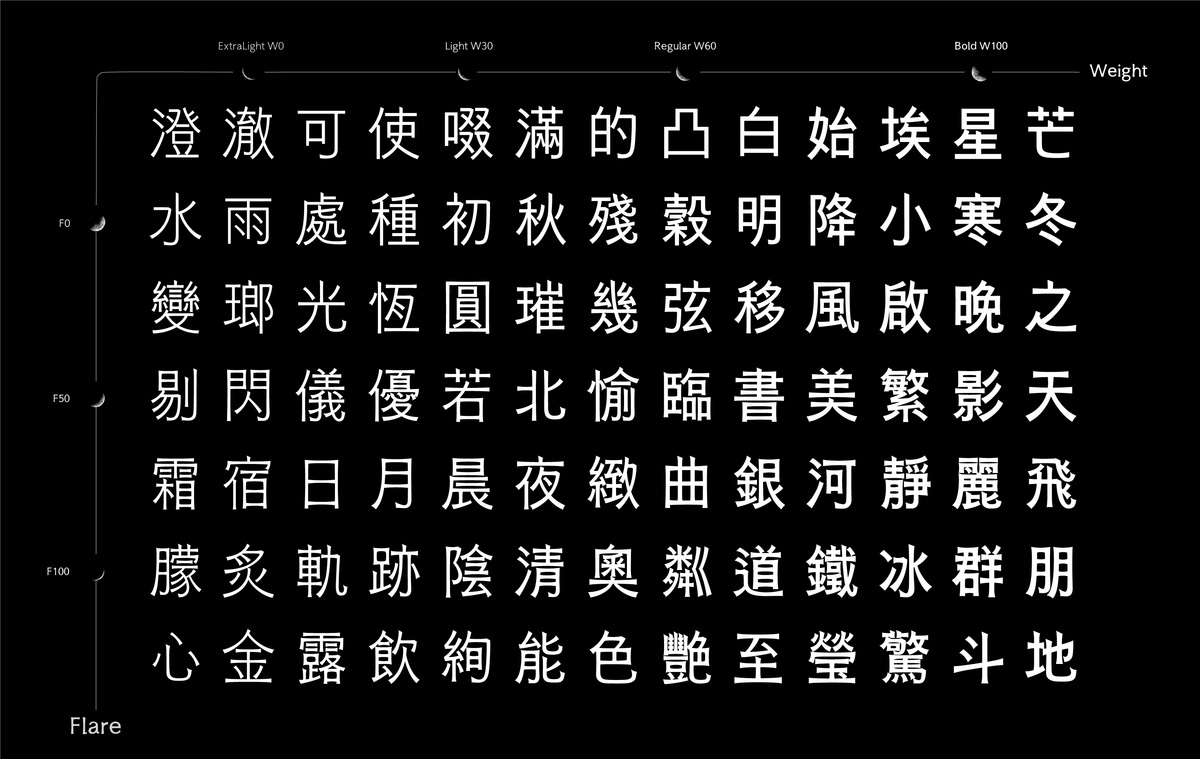
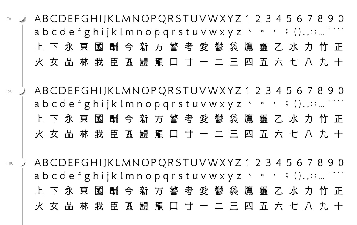
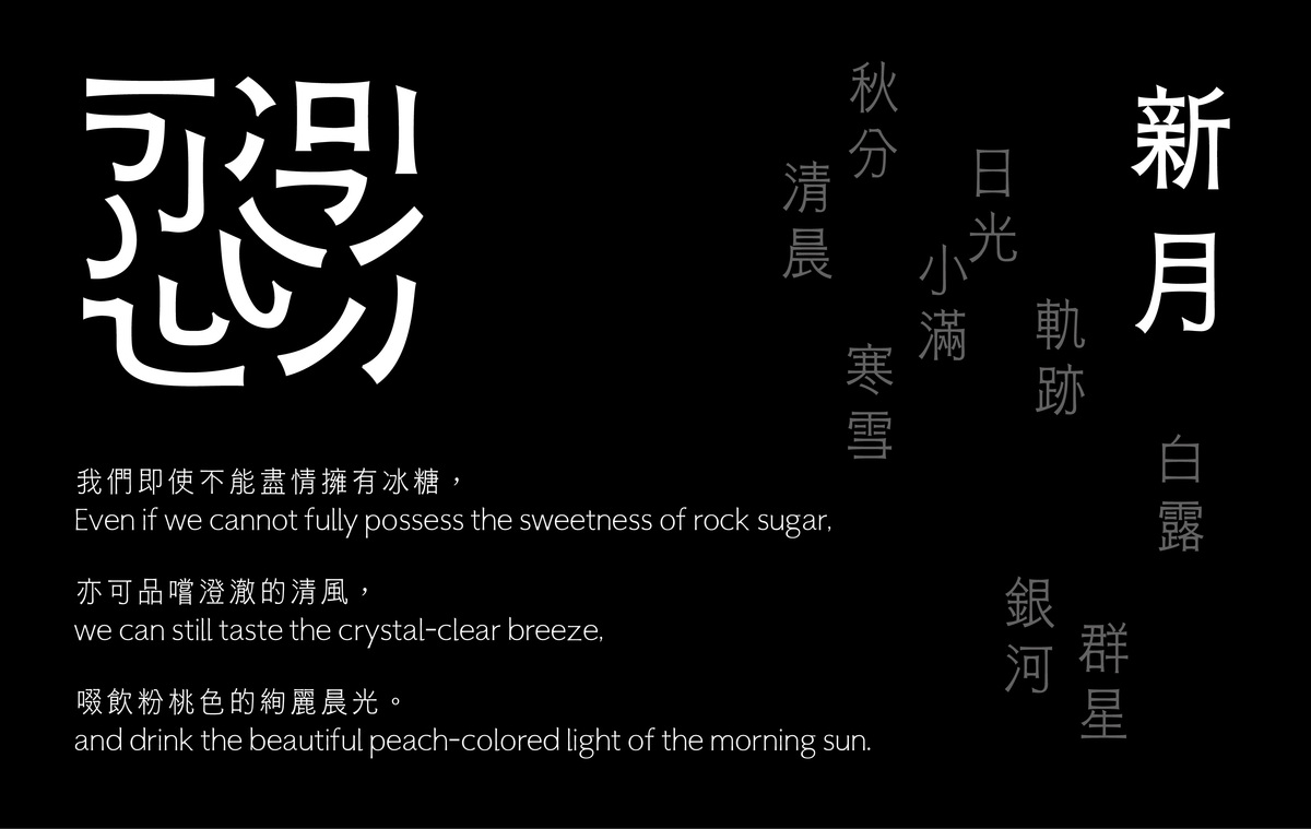
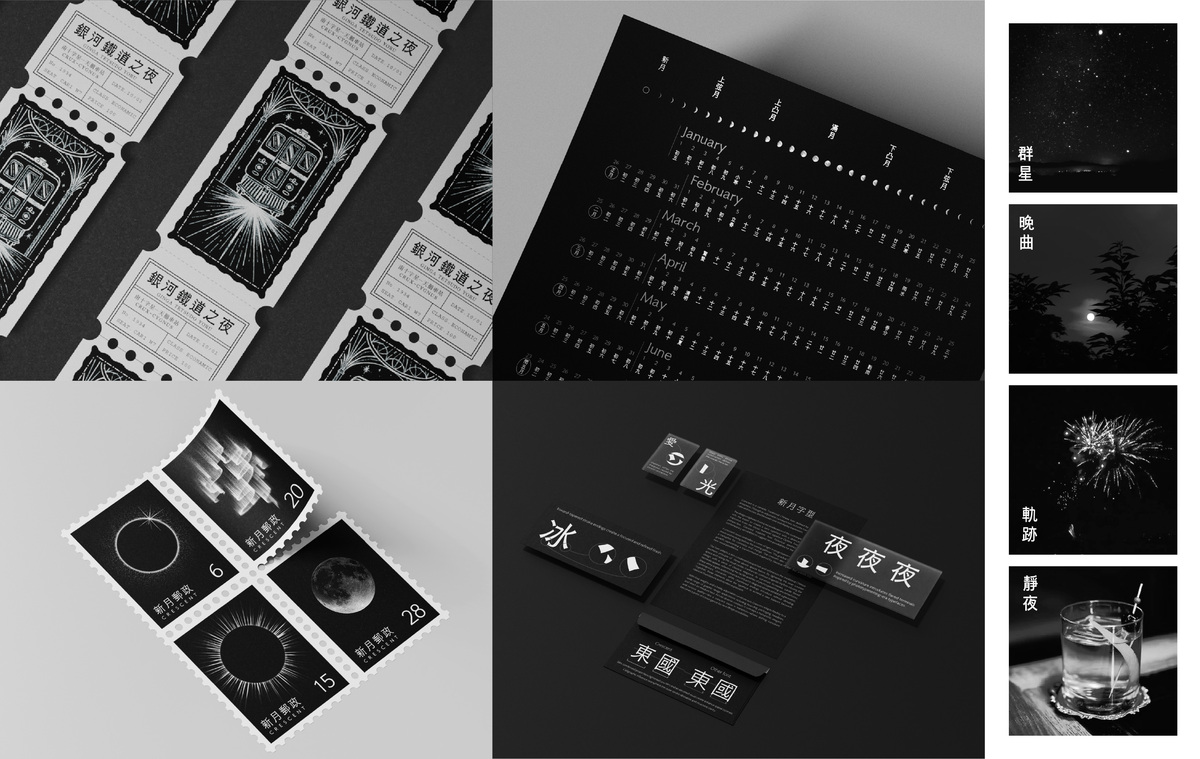
Crescent is a variable typeface inspired by the changing phases of the moon, expressing a gradual shift in curvature. Its letterforms transition between calmness and sharpness. As a symbol of renewal and growth, Crescent reflects the transformation of classical rhythm into crisp, contemporary strokes, achieving an elegant yet incisive balance reminiscent of the crescent moon.
Ascend
Bachelor Program in Digtal Marketing Design, Ming Chi University of Technology
Life rises and falls; when we feel depleted, we need a change of scenery—
Ascend is a journey that helps travelers step out of noise, step into serenity, step up to Maokong, and step back to yourself. Through these four stages, you can savor Maokong’s ease and tea aroma, and gently return to the rhythm of life.
Maokong, located in the mountainous area of Taipei, Taiwan, marks the boundary between city and nature. We use the most iconic transport—the Maokong Crystal Gondola—as the core image. As the gondola rises, the passenger's view expands, revealing a clearer and more open landscape. When looking through the glass, they not only see the distant scenery but also their own reflection, a reminder that this journey belongs to them, and that their focus should return to themselves.
We have received your opinions, and will get back to you as soon as possible!